
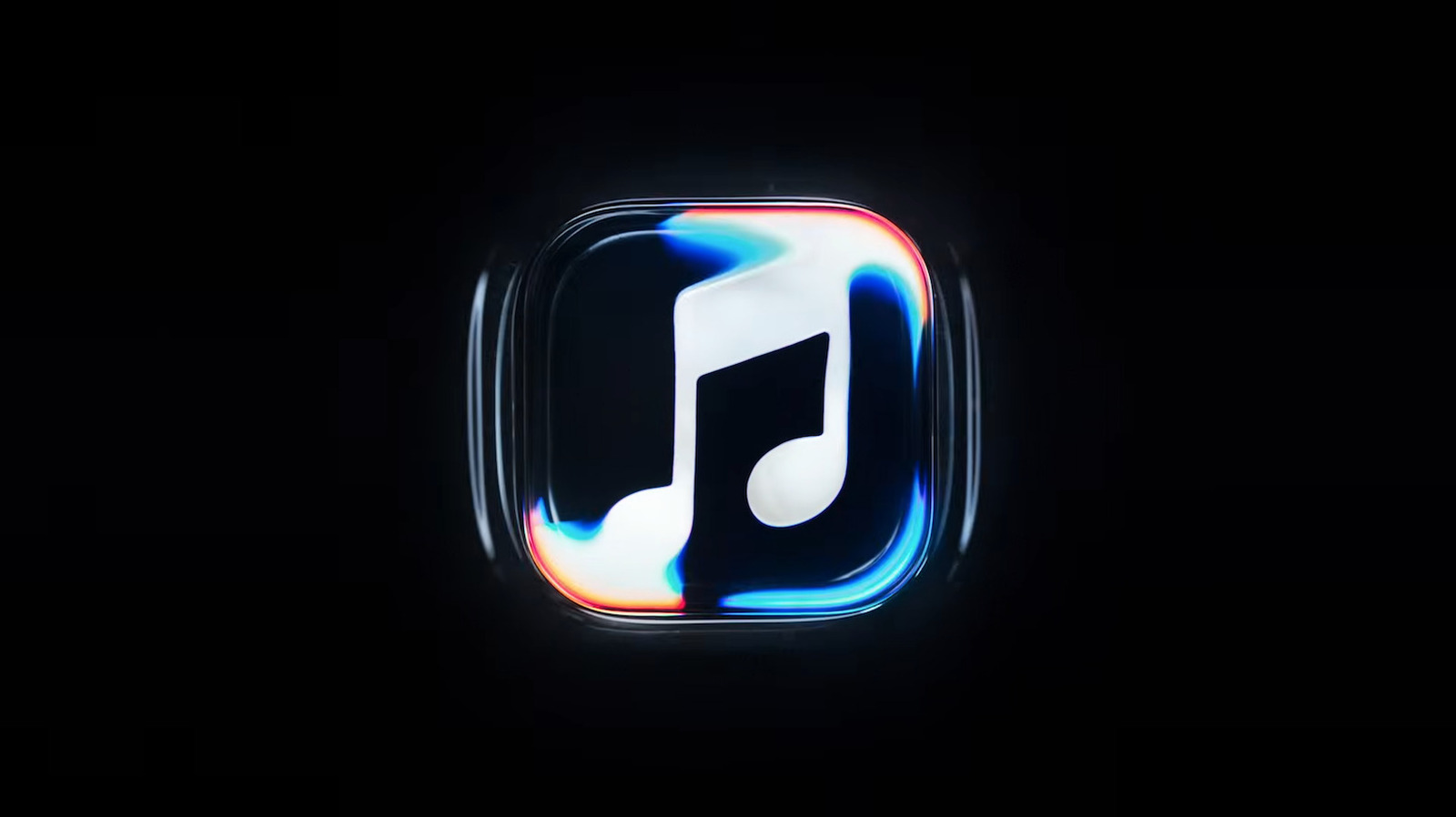
Apple has unveiled a new Apple Music logo featuring a musical note beneath rippling water effects. The dynamic design was created through practical effects, etching the logo onto a glass floor filled with mineral oil. Tones played by an instrument caused the oil to ripple, which was then filmed. This rebrand pairs with Apple's Liquid Glass design language and was a collaboration with music producer Fred Again and NEST Acoustics. The narrator explains the goal was to "distill music into something visually beautiful," essentially creating the perfect sound wave.
The motion-filled ripple logo will appear at the start of Apple Music videos and concert footage. Separately, the actual app icon is shifting from red to a black-and-white design, a change that has drawn criticism online. These updates are slated to debut with the company's next software releases, including iOS 27.2 and macOS 27.2.
Apple emphasized the partnership between technology and music, stating sound created the visuals for the rebrand. The black-and-white icon shift represents a significant departure from the previous colorful branding, though audiences have yet to widely embrace the new minimalist look.
Source: Engadget · Summarized by HeadlinesBriefing