
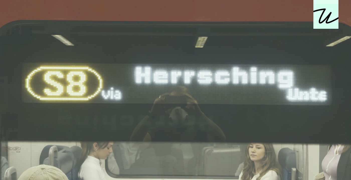
This article explores the mechanical quirks of digital displays, specifically how line-by-line updates create a slanted effect resembling rolling shutter in photography. The author reflects on the history of typographic conventions, noting that the standard left-to-right scrolling and italic slant are cultural choices rather than inherent necessities. The piece argues that different choices, such as right-to-left scrolling or left-leaning slants, were entirely possible.
It celebrates the craft of typography through various examples of small caps, vertical ligatures, and creative underlining found on old keyboards and typesetting machines. The author suggests that appreciating these details requires a culture that values the 'right fork in the road' when designing type. While some examples are deemed intentional craft, others remain subjective, leaving the reader to decide if they are good or merely novel.
The narrative weaves technical explanation with observations about the aesthetics of character rendering, highlighting how constraints can lead to delightful design solutions. It ultimately serves as a meditation on the hidden mechanics behind everyday visual text and the intentionality (or lack thereof) in type design.
Source: Hacker News · Summarized by HeadlinesBriefing